The thing that first attracted me to this Marketing Madness was the “Baker’s Dozen” highlighted in red below. So I decided to see if I could come up with 13 (baker’s dozen, get it?) reasons why this website is awful.
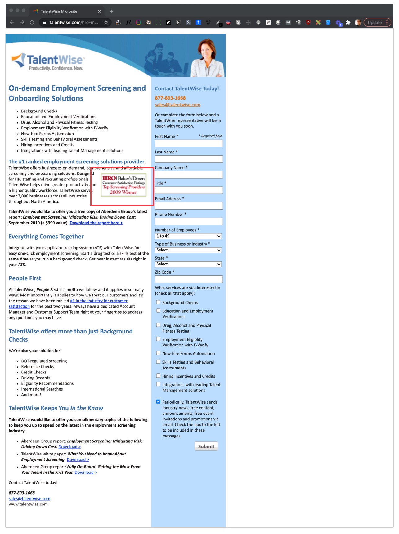
1. Notice the big white space on the side of the page? That’s because whoever built this page, never thought there might be a screen that’s larger than a piece of 8 1/2 by 11 inch paper!
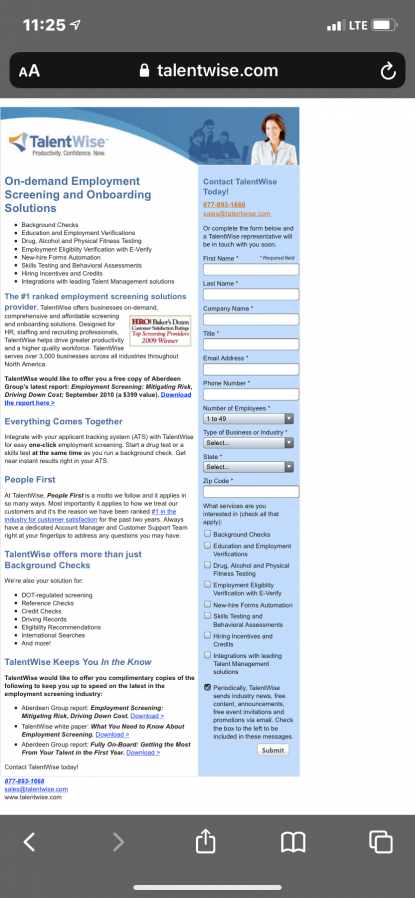
2. BTW, on a phone it’s even crappier. Responsive much?
3. Nice try adding some, oh let’s call it ‘graphics’ up there. Ya have your basic business-suit, white lady arms folded at a resolution of twenty-crappy by forty-crapola pixels.

4. While we’re trashing that image selection, let’s not forget the diluted gang of pseudo business people drained of all color but blue.
5. Which brings us to the business itself: background checks. The subtext here is “I’m smiling and I have my arms folder because they’re doing a background check behind me and I have no idea who these blue people are and I am SURE I’m gonna pass because I’m a confident business woman with my arms folded smiling (at a very low resolution)”

6. Logo? Another fail. 3 curved horn sorta triangle shapes that say, “We’re a triangle. We think. We are Three. We represent, uh, three things.”

7. While we’re on that Three Thing, what’s under the logo. Of course, the Three Things. But 2 are things and the other is a preposition or some temporal factor. Which one of these is not like the other? “Productivity confidence now” does not a sentence make.
This calls for a modern copywriting trope: One. Word. Sentence.
“Productivity.” Boom … ya got a sentence.
“Confidence.” Another sentence!
“Now.” Three.

8. Let’s not forget Subheads … and what an assortment! We have one that is 19px and the lead-in to a paragraph with real punctuation. Then 4 others go to 21px size but, let’s not be TOO consistent. One Doesn’t Have Initial Caps! One has italics!

9. Blue. Too much blue. Boring, plain, just-another-corporate-site blue. Blew it.
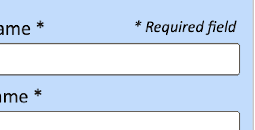
10. All fields on the form are required but then do you need to have an asterisk for all fields…which are required anyway?
11. The Baker’s Dozen! What the MF is this?? A Baker’s Dozen of what? If you’re #1 do I need to know there’s 12 others behind you? Why even make reference to some no-name organization that gives out prizes to 12 other companies?
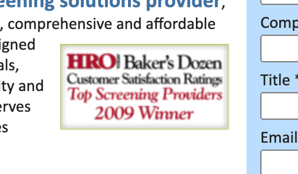
12. 2009?! This Baker’s Dozen has been getting moldy for 12 years and you’re still telling us about it like it’s yesterday!?
13 And who is HRO? And why does it look like there’s an exclamation after their name?
