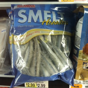
I like how they chose the yellow and a script font for Headless though.
“Okay, it’s less prominent but I don’t want headless to get lost!”
The Museum Of Marketing Madness
Curating, skewering and roasting the worst of advertising to comic perfection

I like how they chose the yellow and a script font for Headless though.
“Okay, it’s less prominent but I don’t want headless to get lost!”