I like how they chose the yellow and a script font for Headless though.
“Okay, it’s less prominent but I don’t want headless to get lost!”

The Museum Of Marketing Madness
Curating, skewering and roasting the worst of advertising to comic perfection
I like how they chose the yellow and a script font for Headless though.
“Okay, it’s less prominent but I don’t want headless to get lost!”
You have to see this first in context:
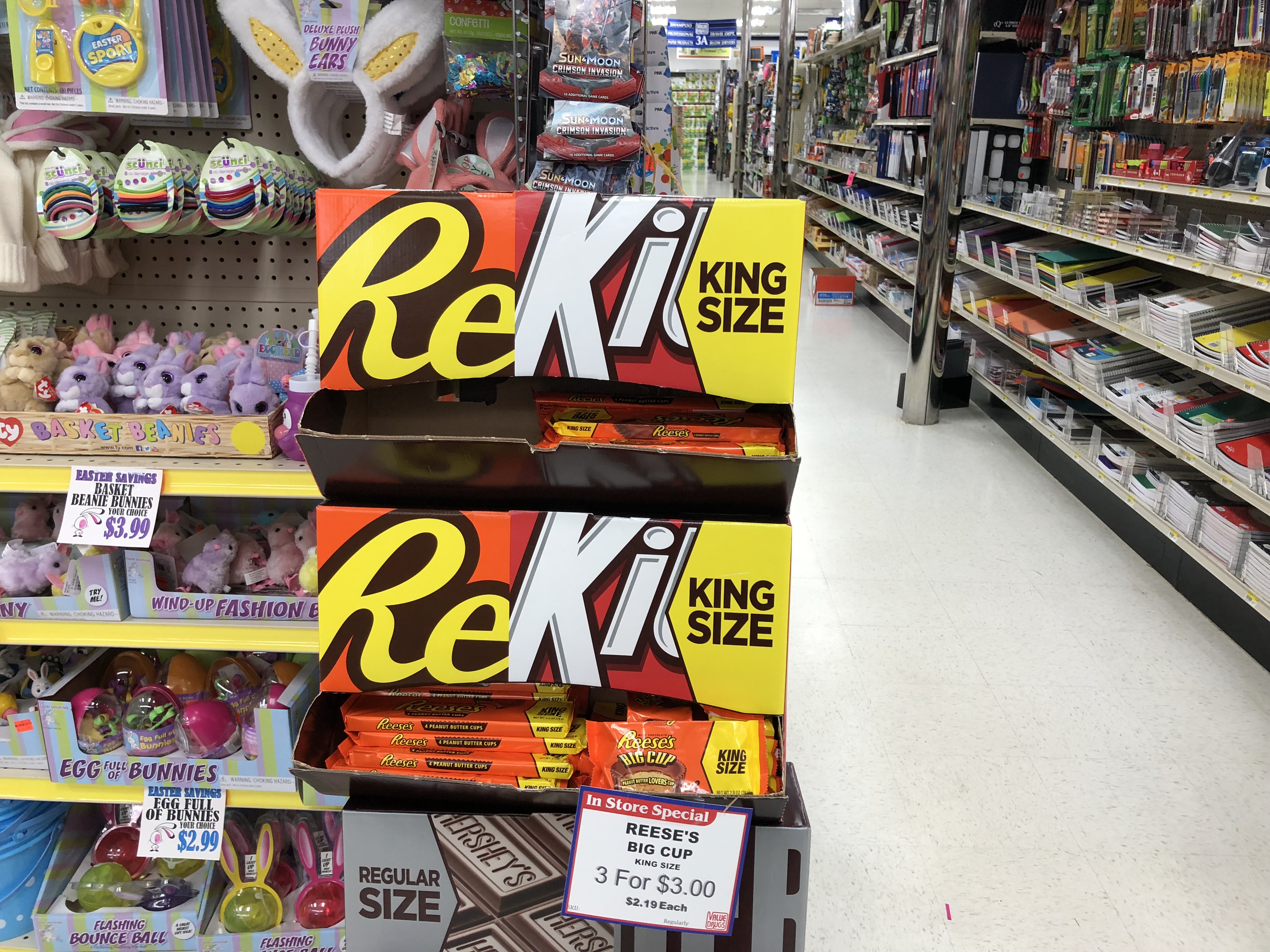
Got that??
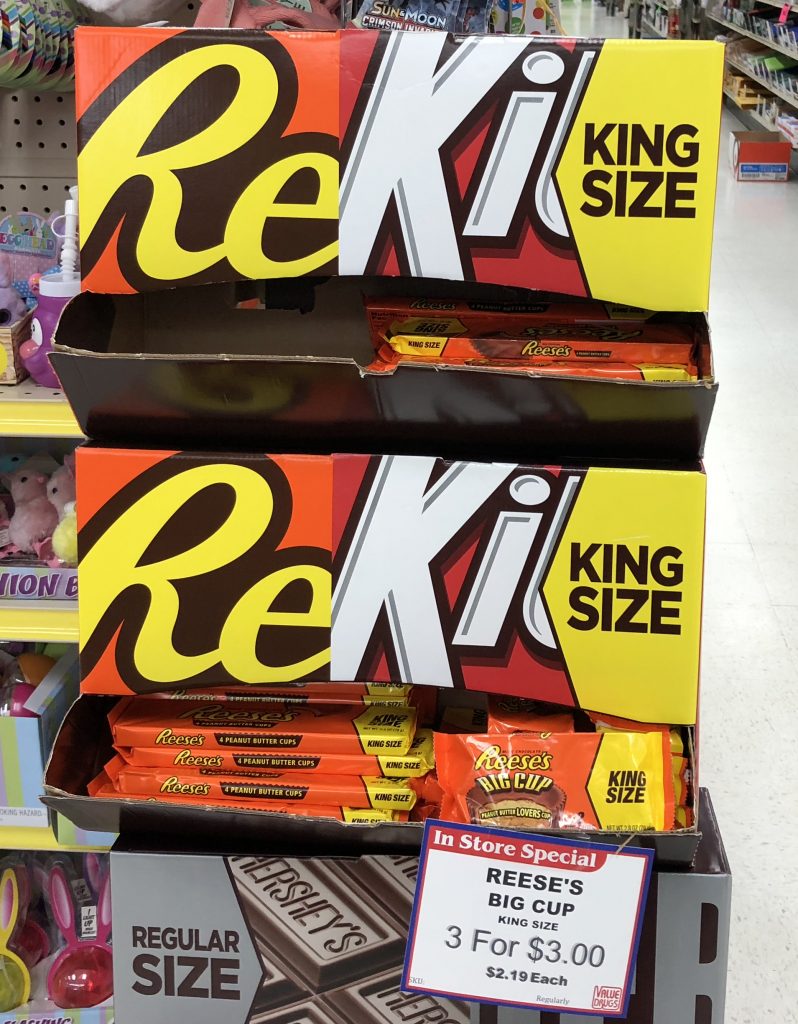
According to their website (www.reiki.org):
The word Reiki is made of two Japanese words – Rei which means “God’s Wisdom or the Higher Power” and Ki which is “life force energy”. So Reiki is actually “spiritually guided life force energy.”
Whereas, here “ReKi” is made up of two candy products – Reese’s and Kit-Kat bars. So ReKi is an an in-store, standup display of Reese’s Peanut Butter Cups and KitKat® bars.
I think the synergy and power cannot be ignored. One is healing and spiritual. The other is chocolate-y and delicious.